• VIEW DETAILS • VIEW DETAILS
UX / UI Project

BBVA - Bonus PIU

Bonus PIU is Garanti BBVA's credit-card loyalty program — a points system paired with a prepaid shopping card. When I joined the project, the core issue was clarity: users couldn't tell at a glance whether they were looking at loyalty points or actual money in their account. That confusion surfaced repeatedly in support tickets and usability testing, where users often mistook loyalty points for prepaid card balance.

My job was to fix that ambiguity without stripping out the flexibility that made PIU valuable in the first place — a flexible earn-and-spend system across a wide partner network.

Role

  • Product Designer in a cross-functional team with UX Research, Product, and Engineering, one of three designers on a 4-month project.

Challenge

  • Users couldn't distinguish loyalty points from real balance, and the earn/spend rules across partner brands were opaque enough that people under-used the card out of uncertainty about what they'd actually get.

Business Goals

  • The goal was to grow adoption of the Bonus PIU ecosystem, encourage repeat engagement with rewards, and reduce cashback- and card-related support requests.

If users have to relearn how their own money works, the design has already failed.

User and employee surveys

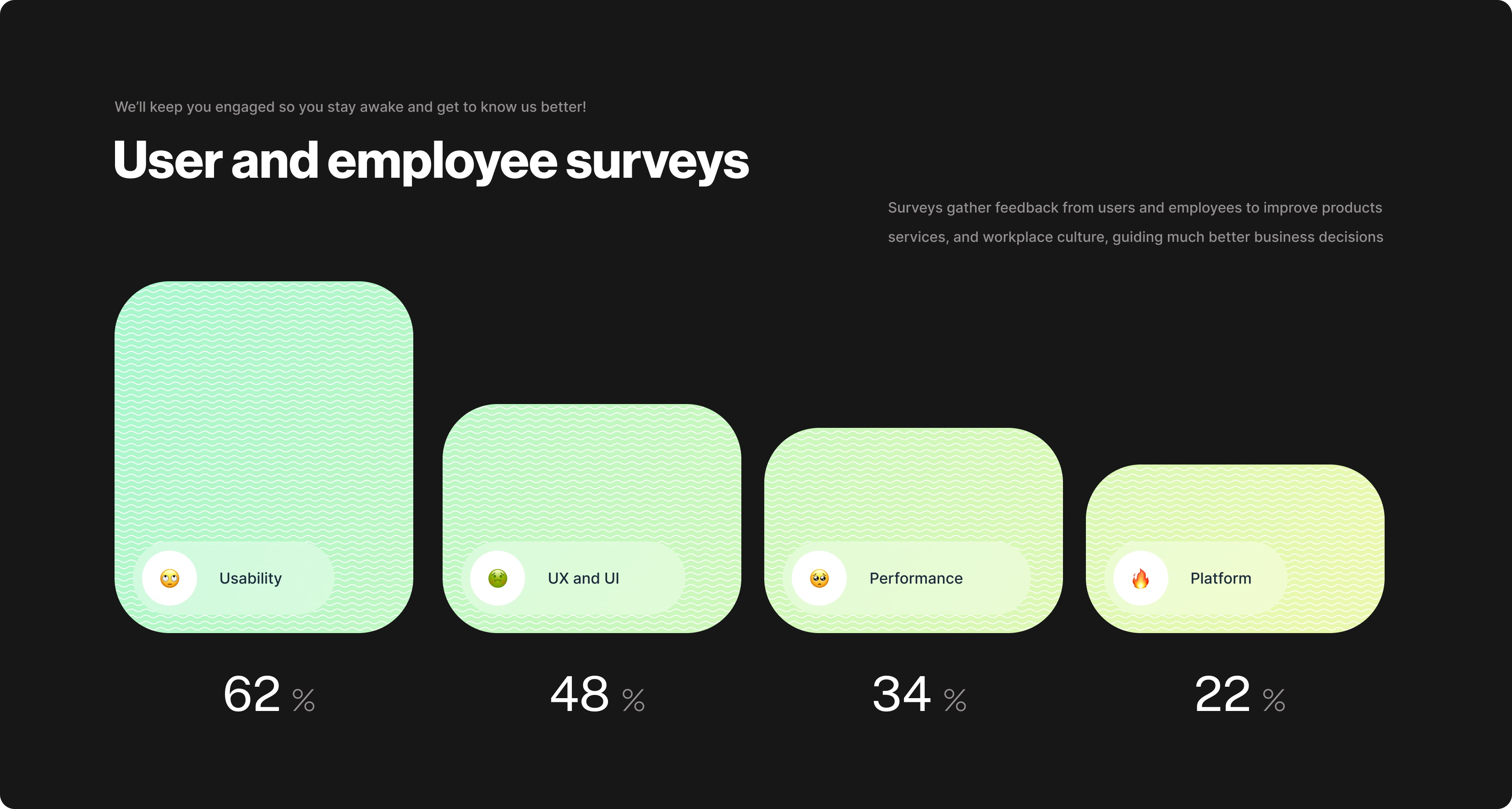
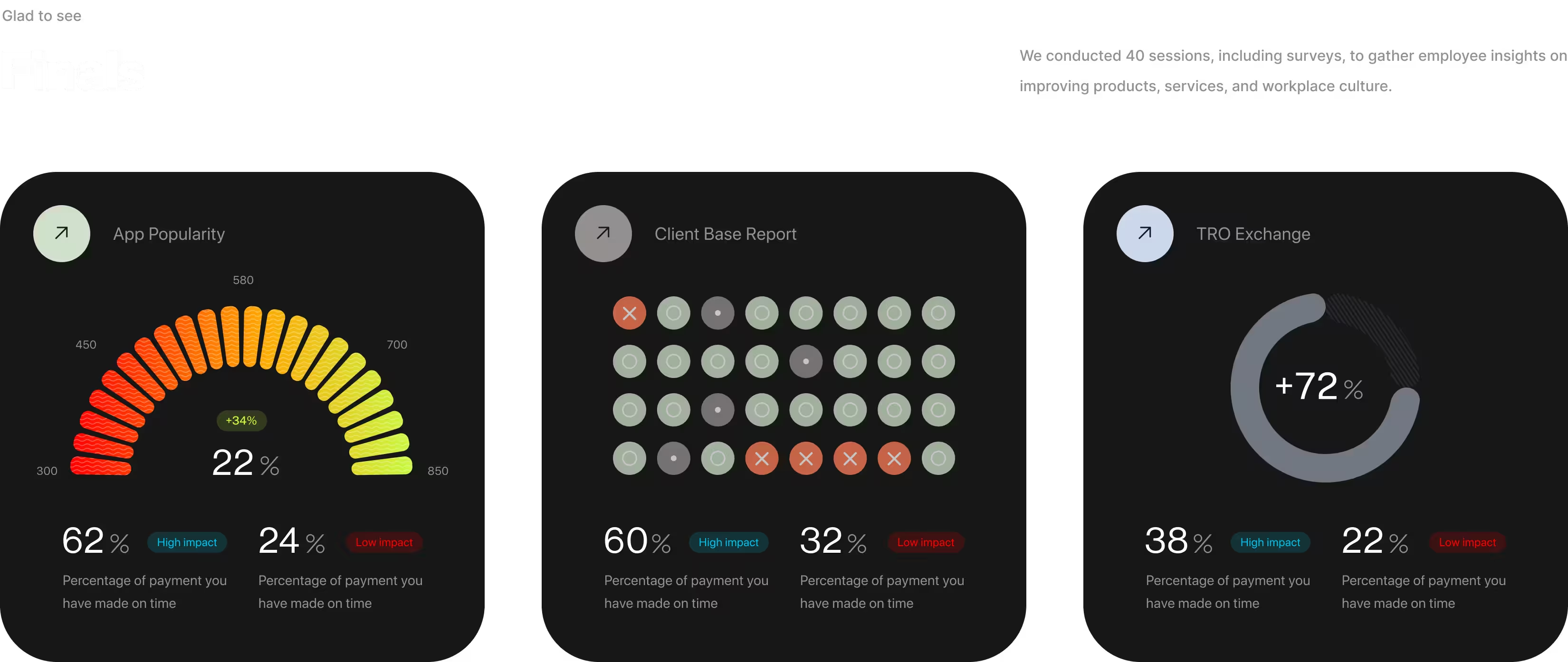
Before redesigning anything, I needed to know exactly where users were struggling — was it speed, stability, or something more fundamental? A survey across existing cardholders showed usability issues at 62%, far ahead of UX/UI concerns (48%), performance (34%), or platform complaints (22%). That gap pointed to a comprehension problem at the core, which is why the rest of this project prioritized clarity over new features.

The numbers told us where to look. These conversations told us what it actually felt like.

User feedbacks

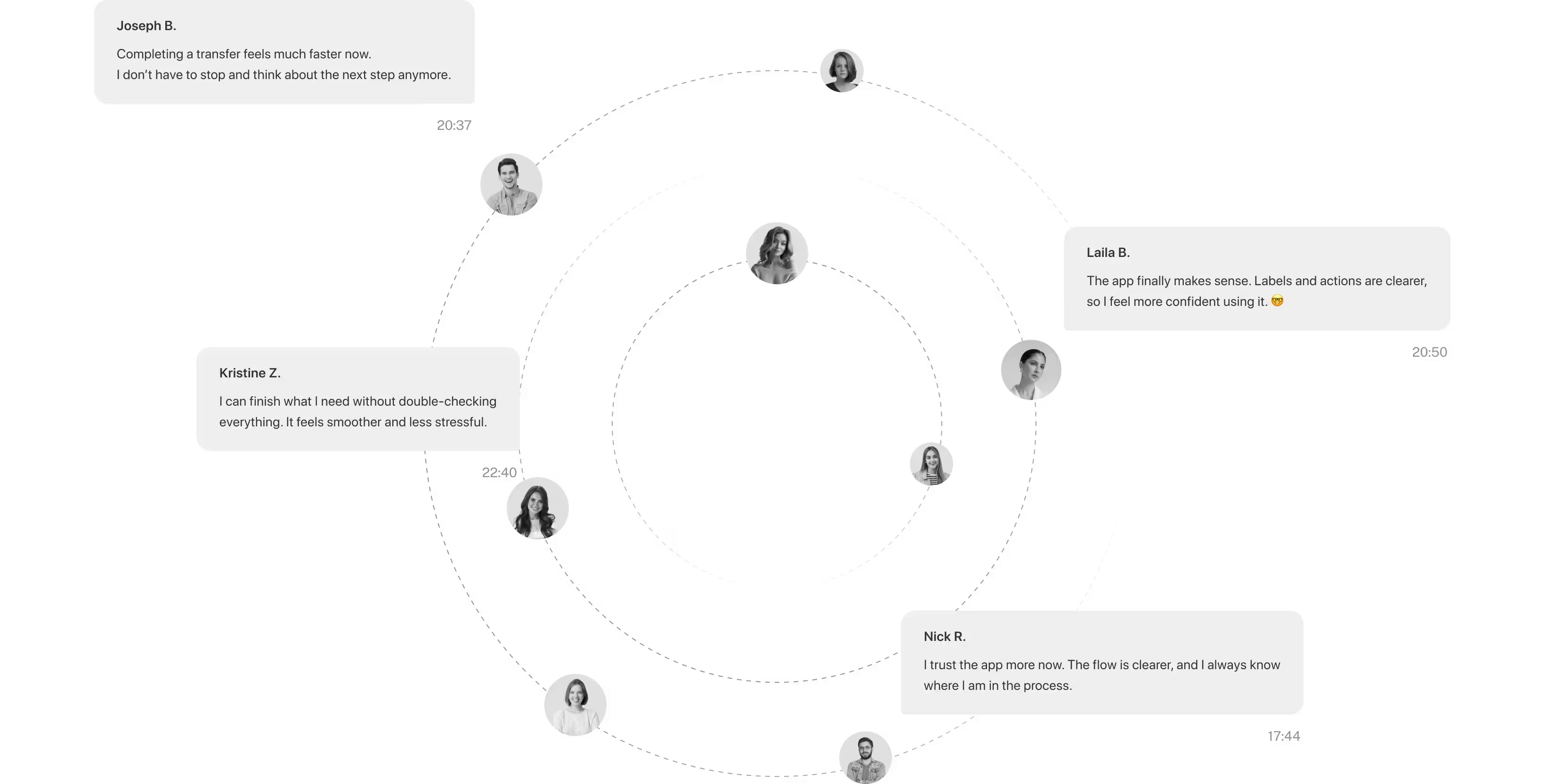
The survey told us usability was the core issue. These follow-up conversations showed what that looked like in practice — people described the app in terms of trust and confidence rather than speed. That shift in language, from "confusing" to "I don't have to double-check," is what told us the fix was working before the metrics caught up.

A persona isn't a face on a slide — it's the person who decides whether your redesign was worth it.

User groups

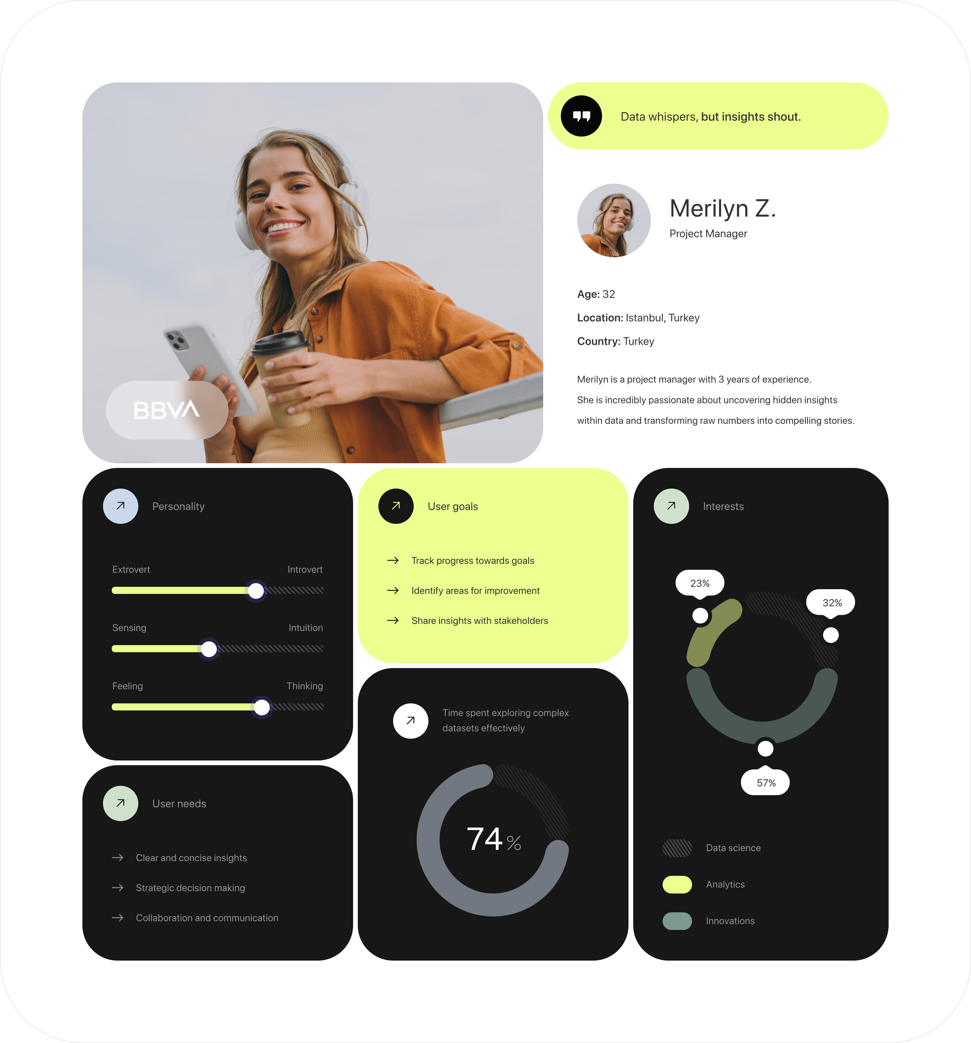
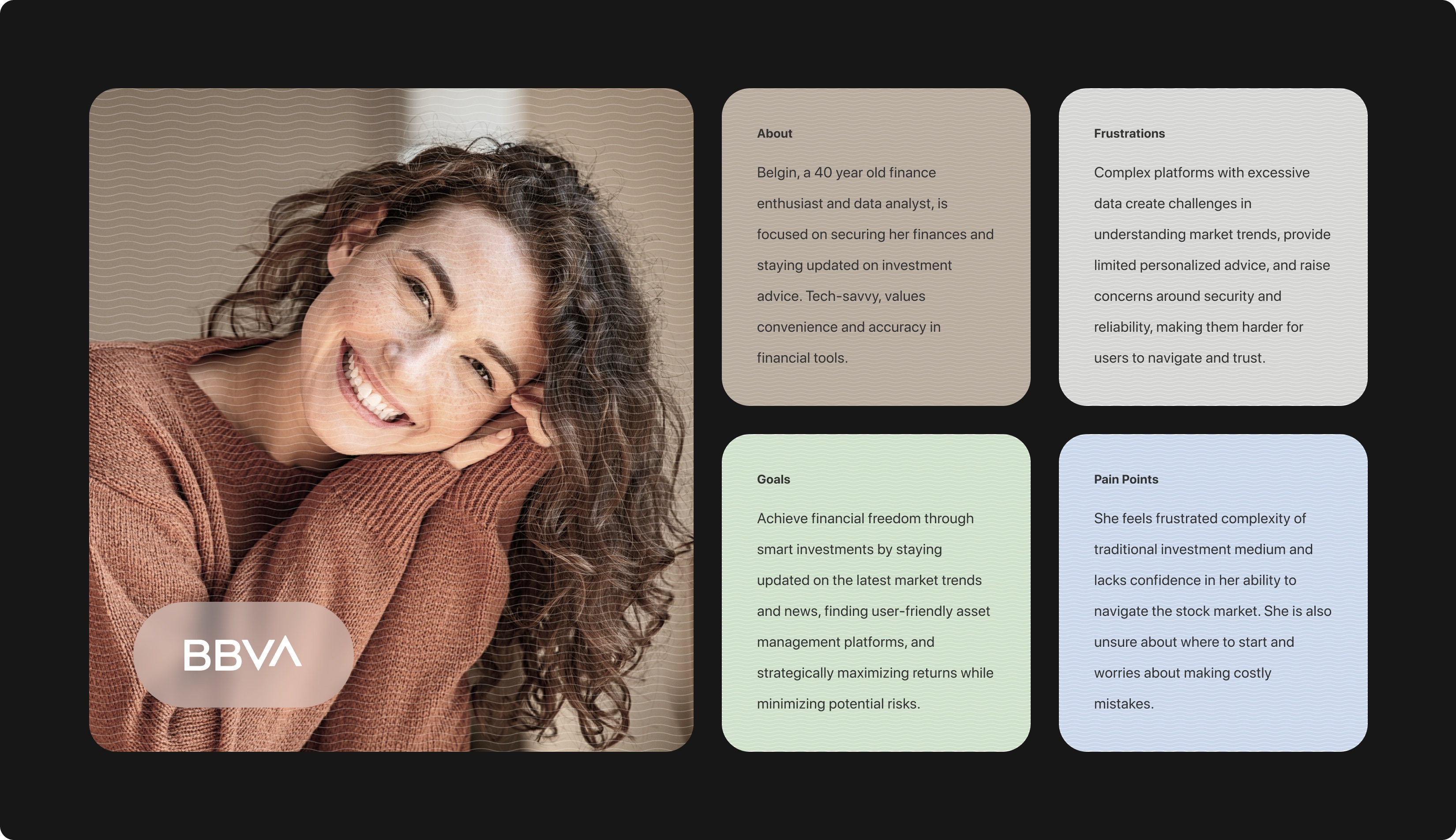
Of the 10 users I interviewed, one profile came up again and again: financially engaged, time-pressed people who wanted to trust their balance at a glance instead of calculating it themselves. Merilyn represents that group. Every screen in this project was tested against one question: would this be obvious to her in three seconds, without her having to think?

Two very different people, one shared moment of confusion — that's what told us this wasn't a one-off complaint.

Personas

Merilyn and Belgin sit at opposite ends of the user spectrum — one juggling a fast-paced job, the other closely tracking her own finances — but both hit the same wall: neither could say with confidence, at a glance, whether a number on screen was spendable cash or a loyalty balance. That overlap, across two very different daily routines, confirmed the problem was structural, not a one-off complaint.

Users didn't want more information — they wanted it pushed to them before they had to ask.

User interviews

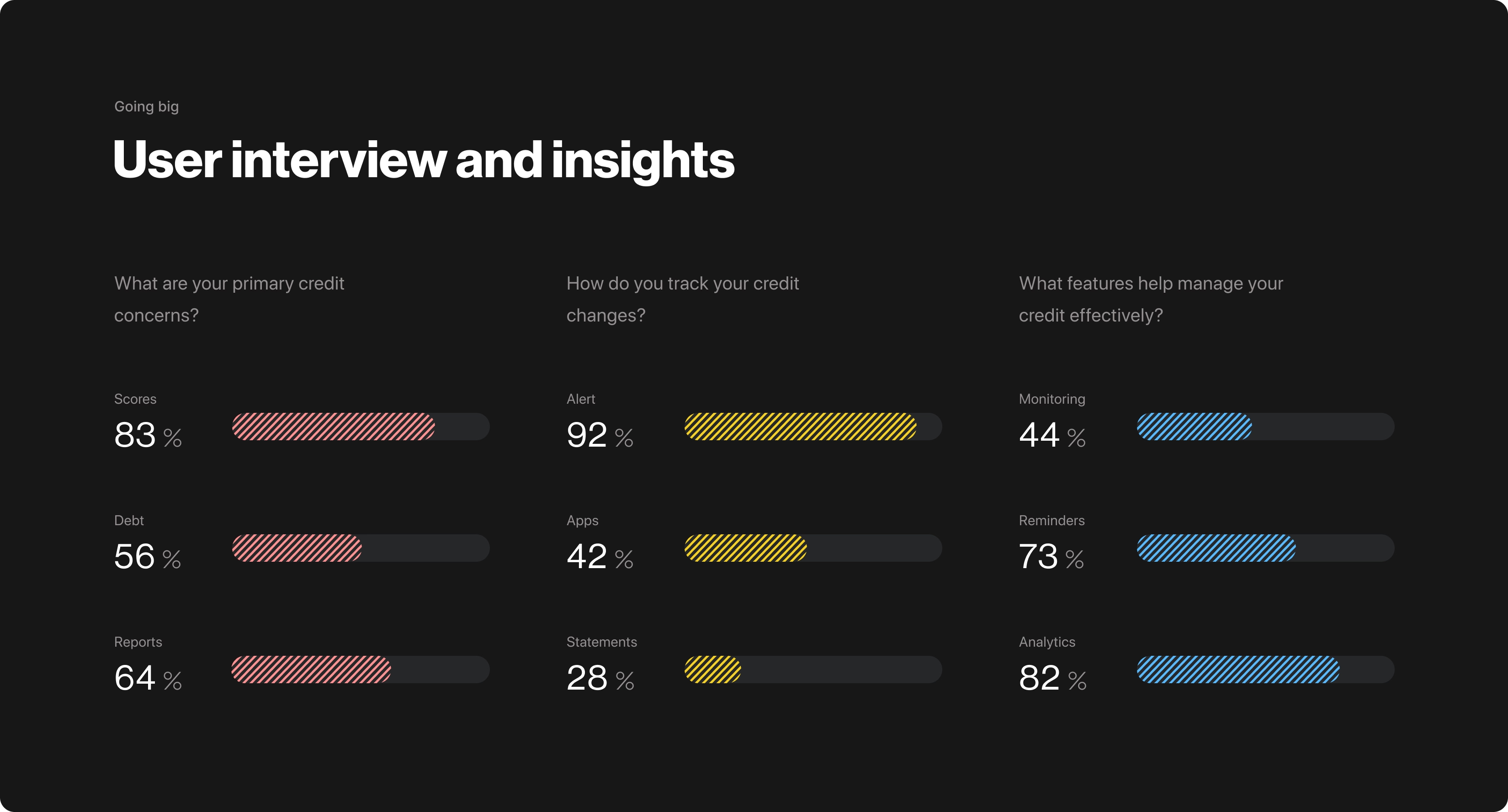
Across the three questions I asked, one pattern stood out clearly: users cared most about being alerted automatically, rather than digging through statements or reports themselves. Alerts and analytics ranked far above manual tracking tools like statements — a directional signal rather than a precise measurement, but consistent enough across sessions to shape a real decision: the final design leads with proactive alerts on the home screen, instead of a passive transaction list users have to search through.

Designing for one market while the roadmap already pointed to six.

Scalability

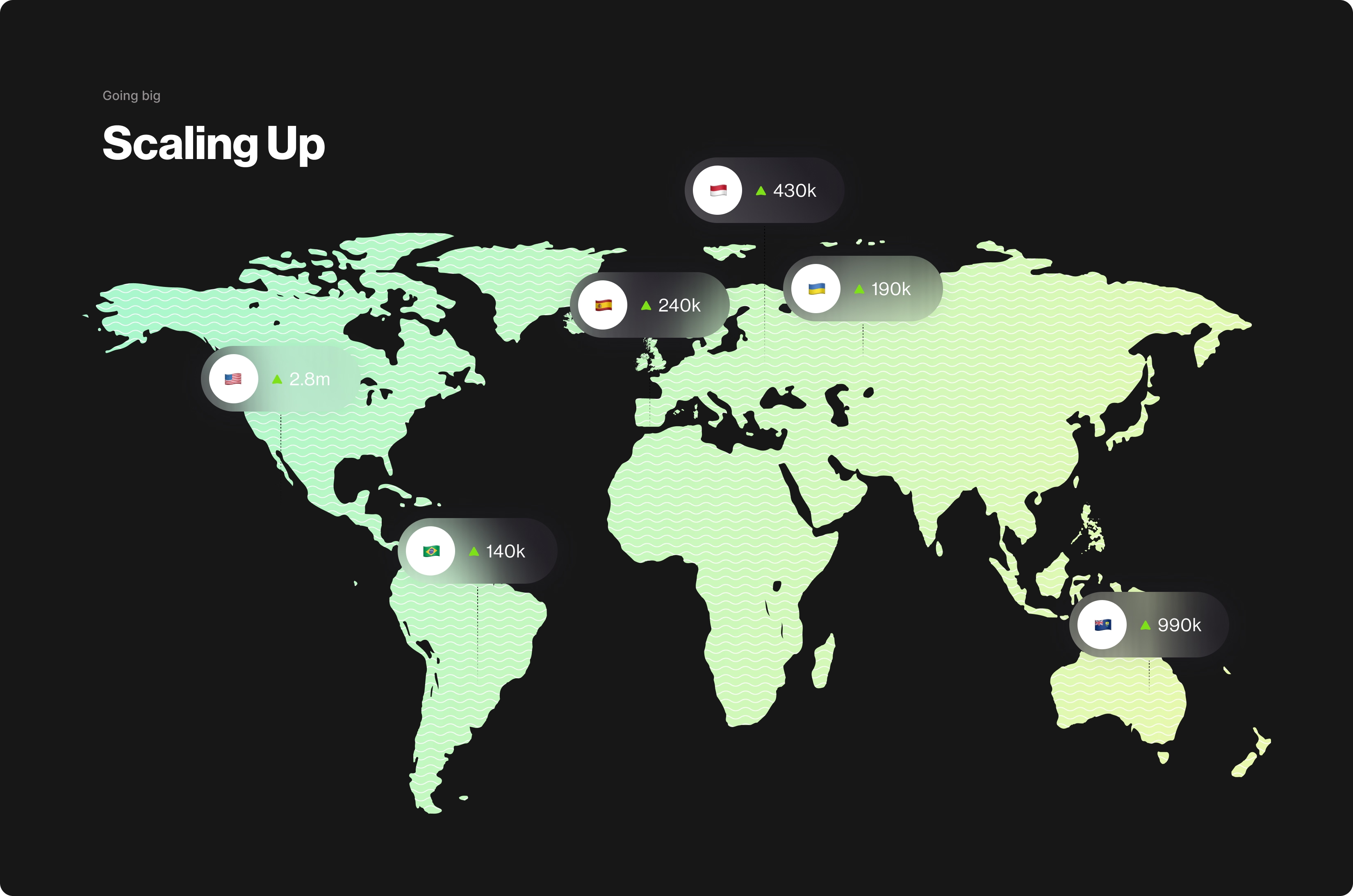
BBVA's growth targets for Bonus PIU extended well beyond Turkey — leadership had already outlined expansion across Germany, Spain, Italy, Mexico, and Argentina as a near-term goal. That meant the balance/points clarity fix couldn't be a one-off patch for a single market; it had to work as a reusable pattern from day one, since redesigning it separately for each new region wasn't realistic on the team's timeline.

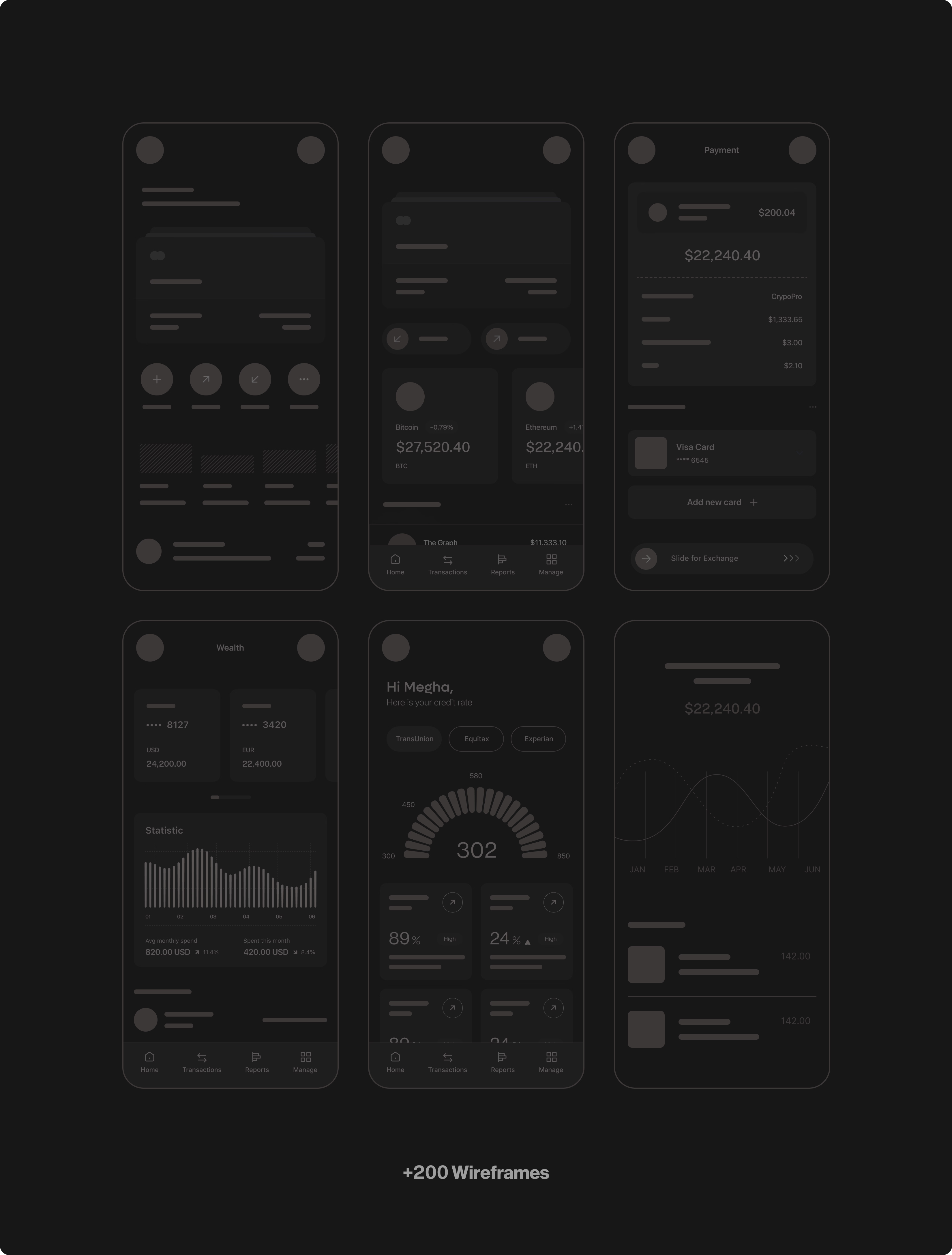
From 200 wireframe variations to the three that actually moved the needle.

Final stage

With the research findings in hand — the usability gap, the alert/analytics preference, the shared confusion across personas — I moved into designing solutions. Not every direction tested well; the numbers below reflect which approaches users actually responded to in testing, regardless of which ones the team personally preferred.

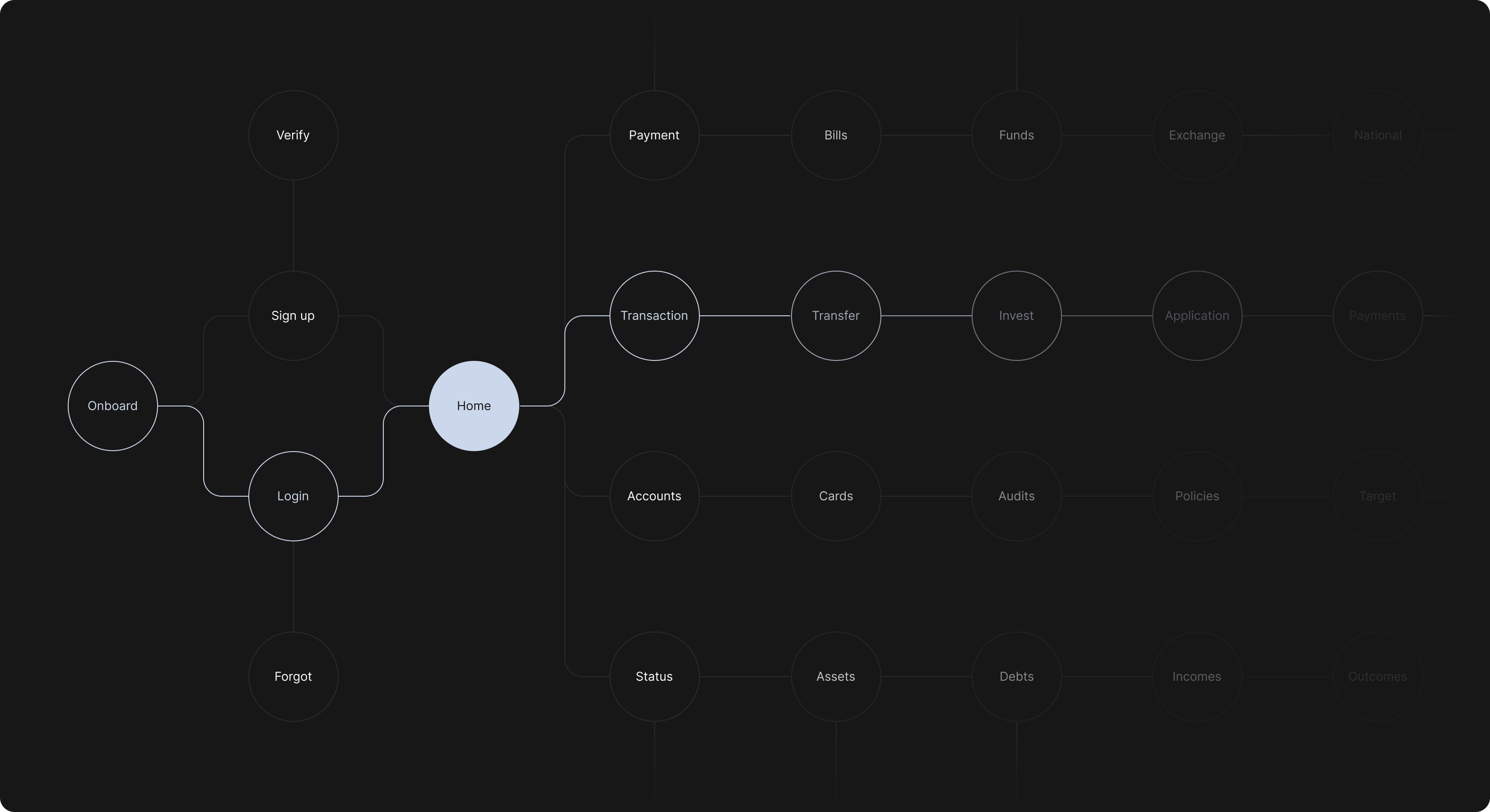
Four branches, one clear rule: money you move, money you have — never mixed on the same path.

Flowchart

Home branches into four clear paths — Payment and Transaction for anything users are actively moving, Accounts and Status for anything they're just checking. That split wasn't arbitrary: it mirrors the exact distinction users struggled with in research — moving money versus simply viewing a balance. Keeping those two mental models on separate branches, rather than blending them into a single "wallet" flow, was the structural fix underneath the visual one.

Three ways to separate points from cash — only one survived first contact with users.

Wireframes

I tested three ways to visually separate points from real balance: color-coding alone, fully separate card modules, or a persistent icon-and-label system. Each was validated in moderated remote usability sessions with 12 existing Bonus PIU users, 45–60 minutes per participant, with tasks focused on identifying balance, redeeming rewards, and checking transaction history. Early testing showed the color-only version still confused users — without a label, a green card just looked like "the good one," not specifically "points." I moved forward with the icon-and-label approach, which held up even when participants glanced at the screen for only a few seconds.

The icon-and-label pairing had to work even when nobody was paying close attention.

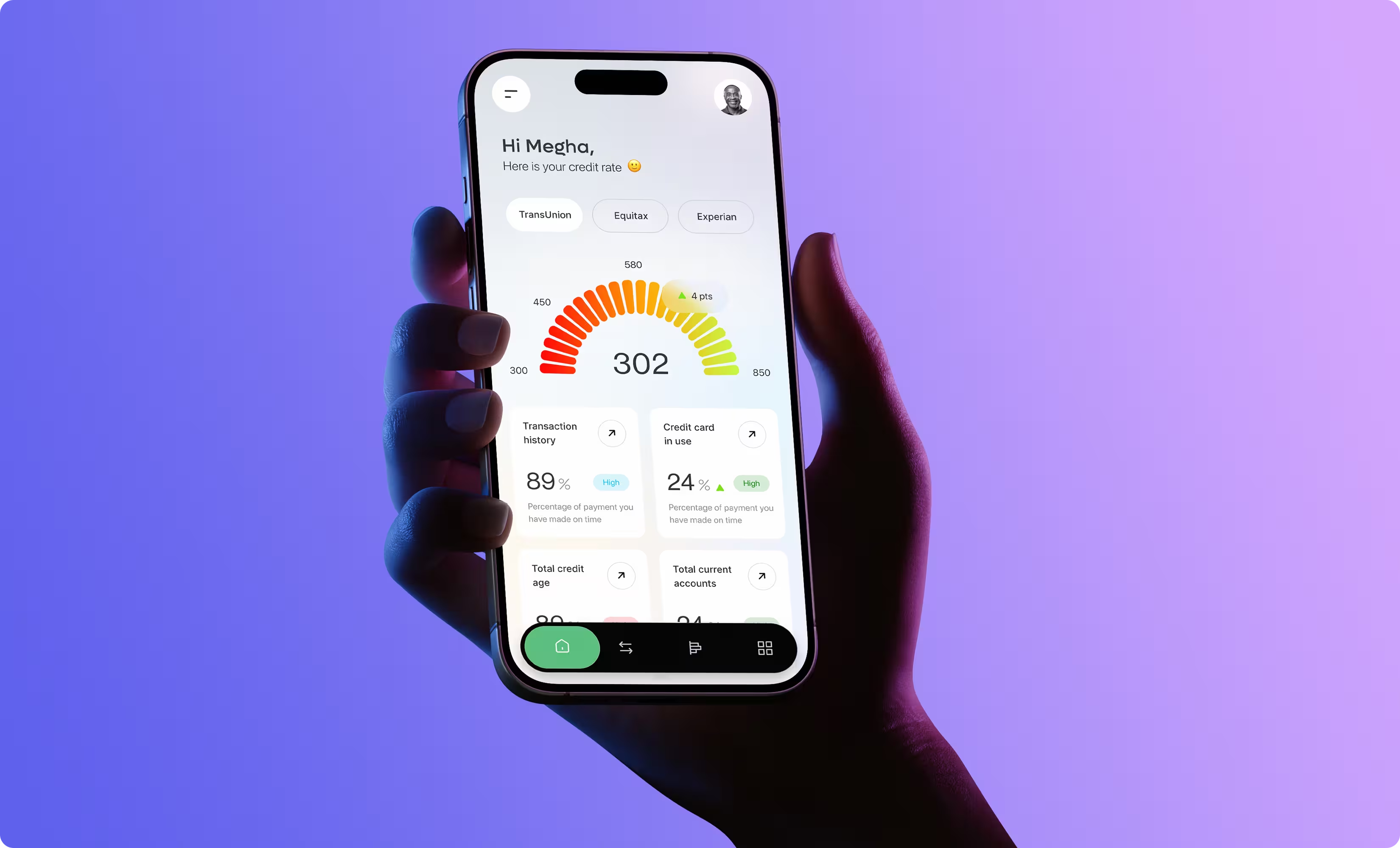
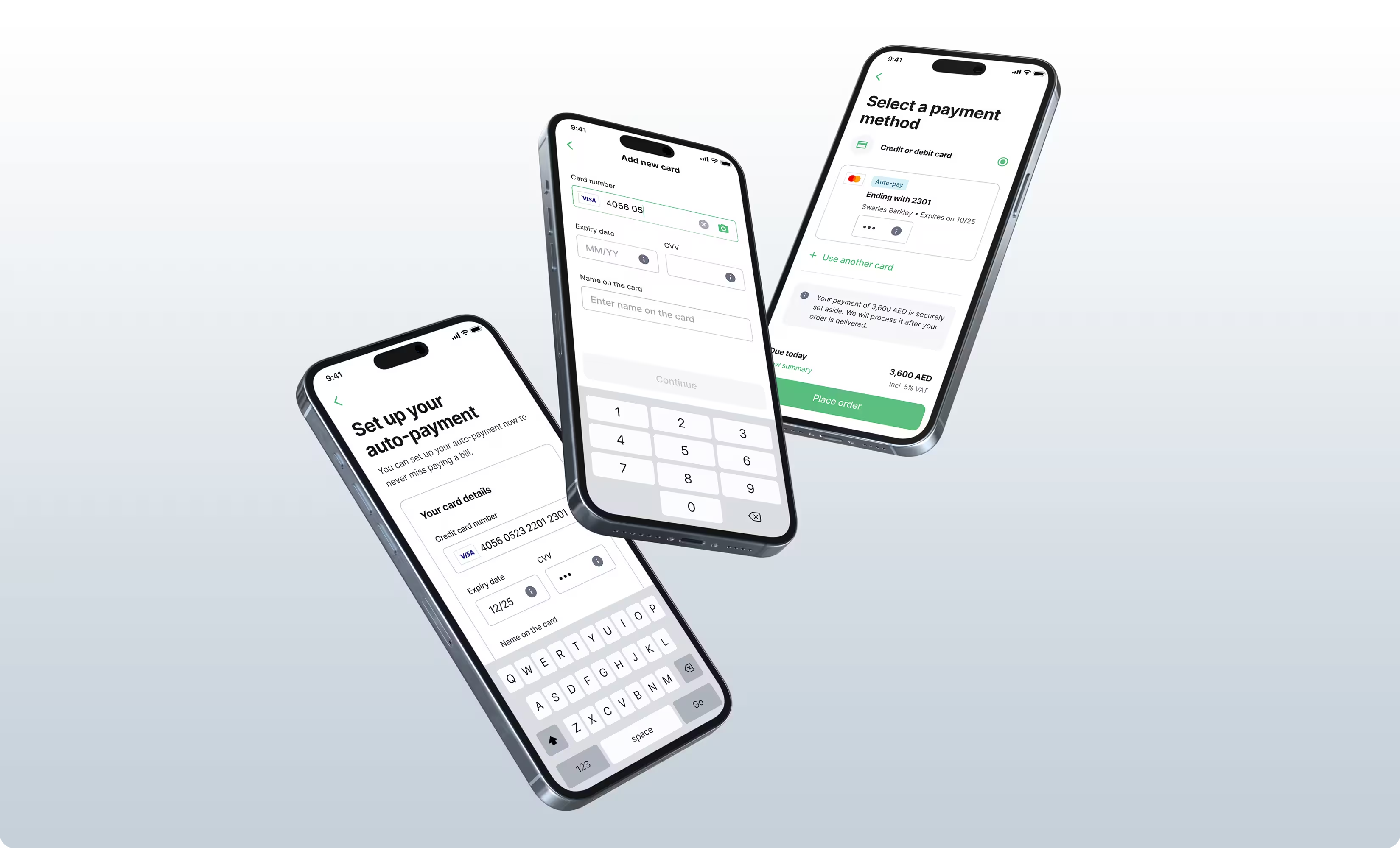
User interface design

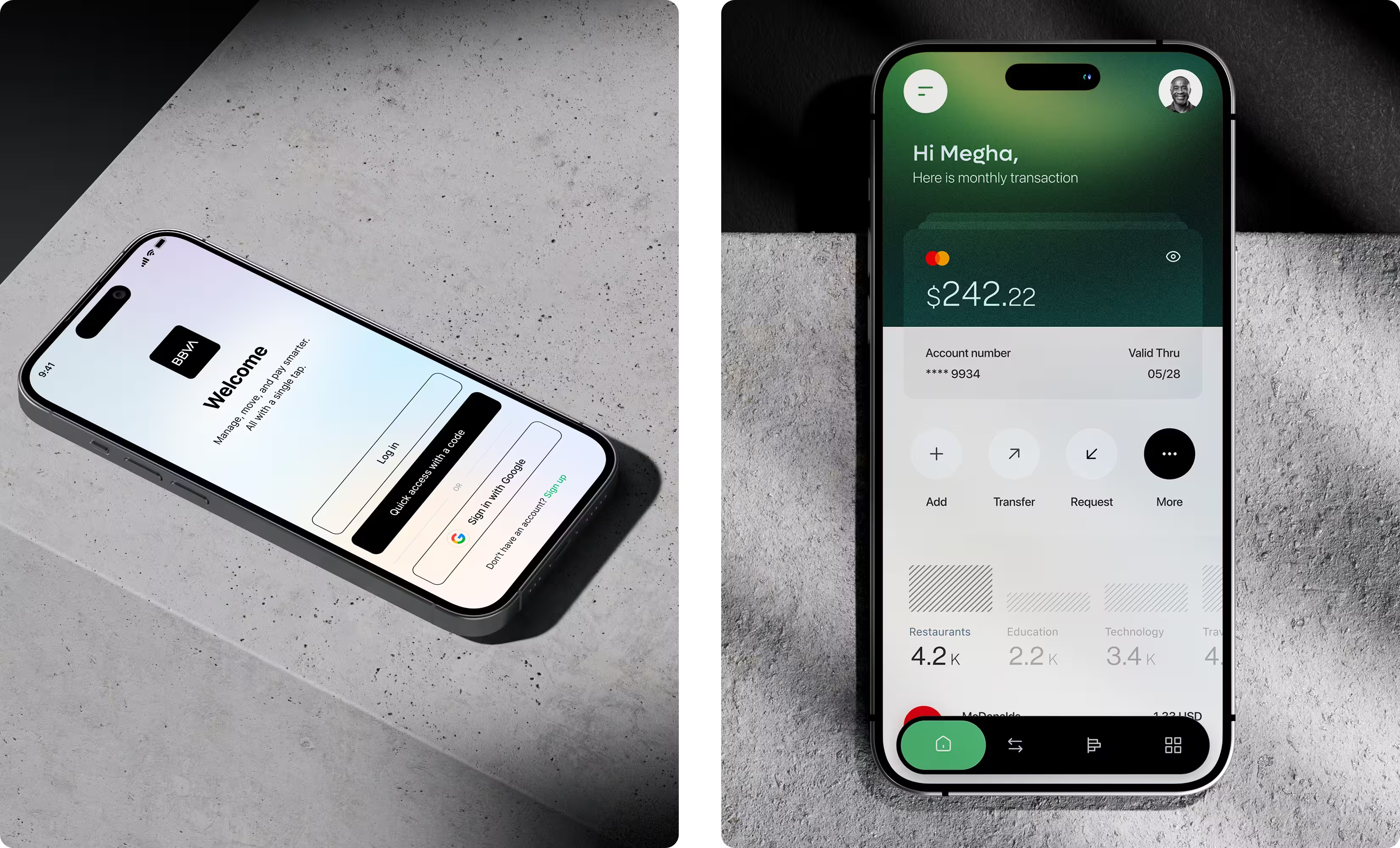
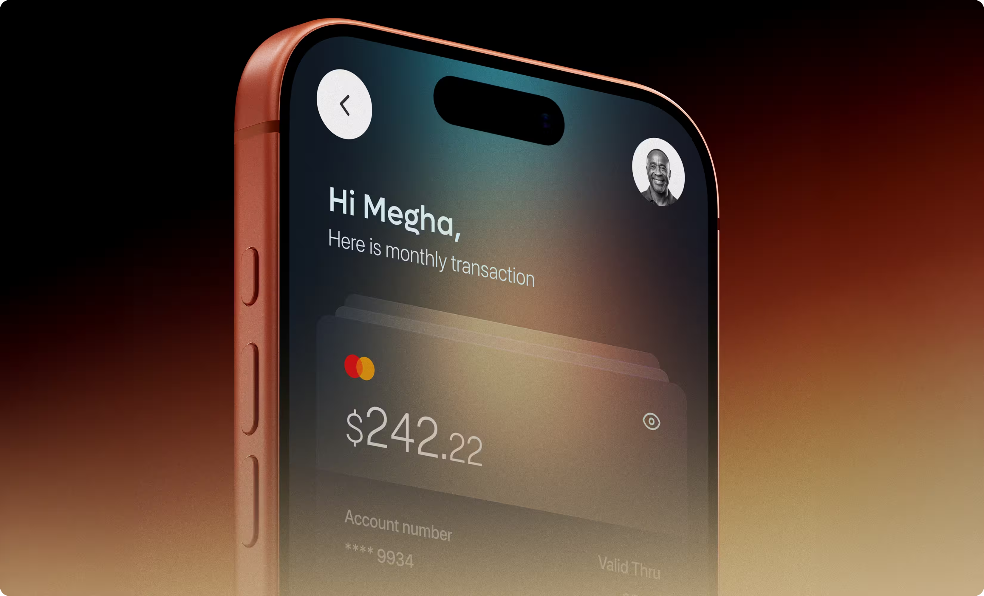
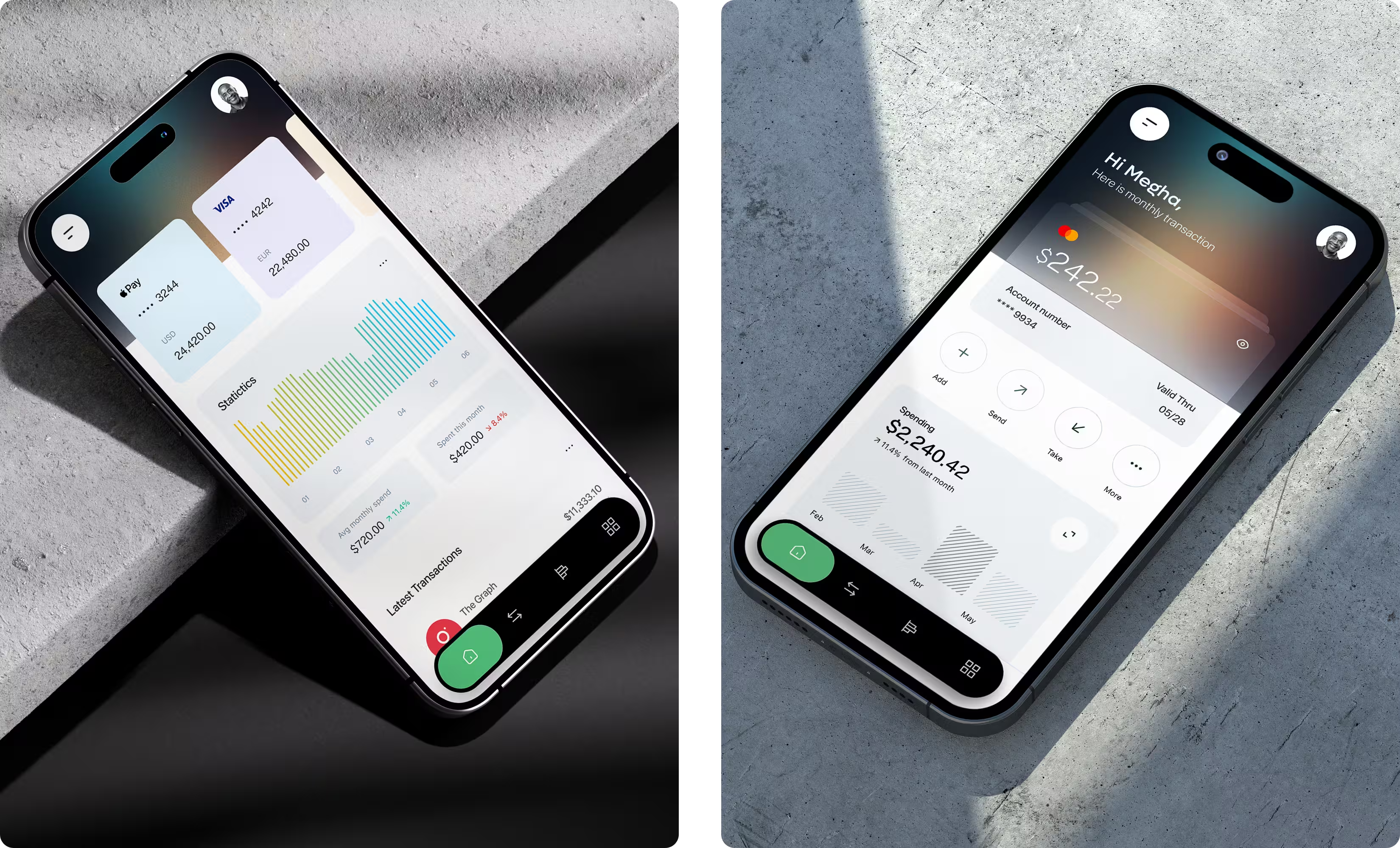
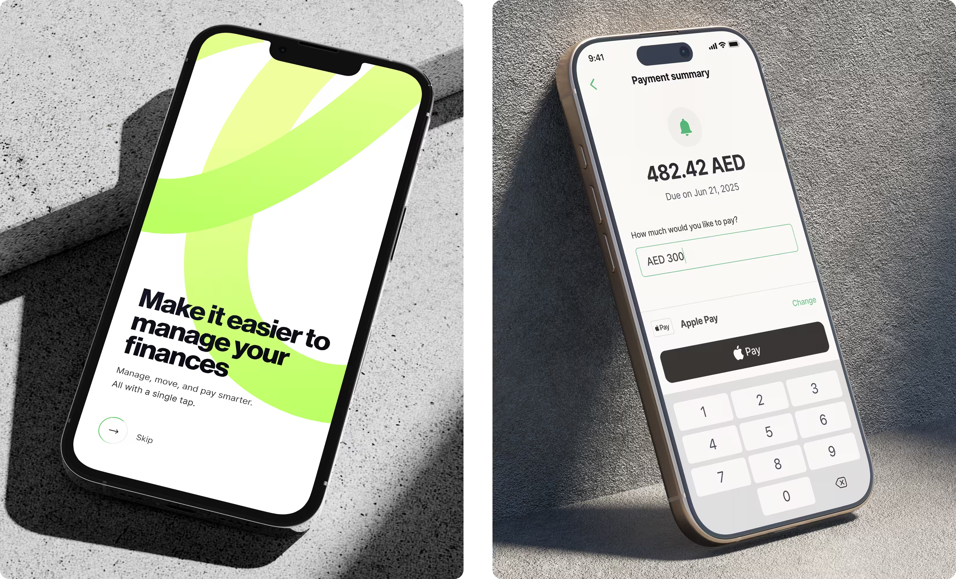
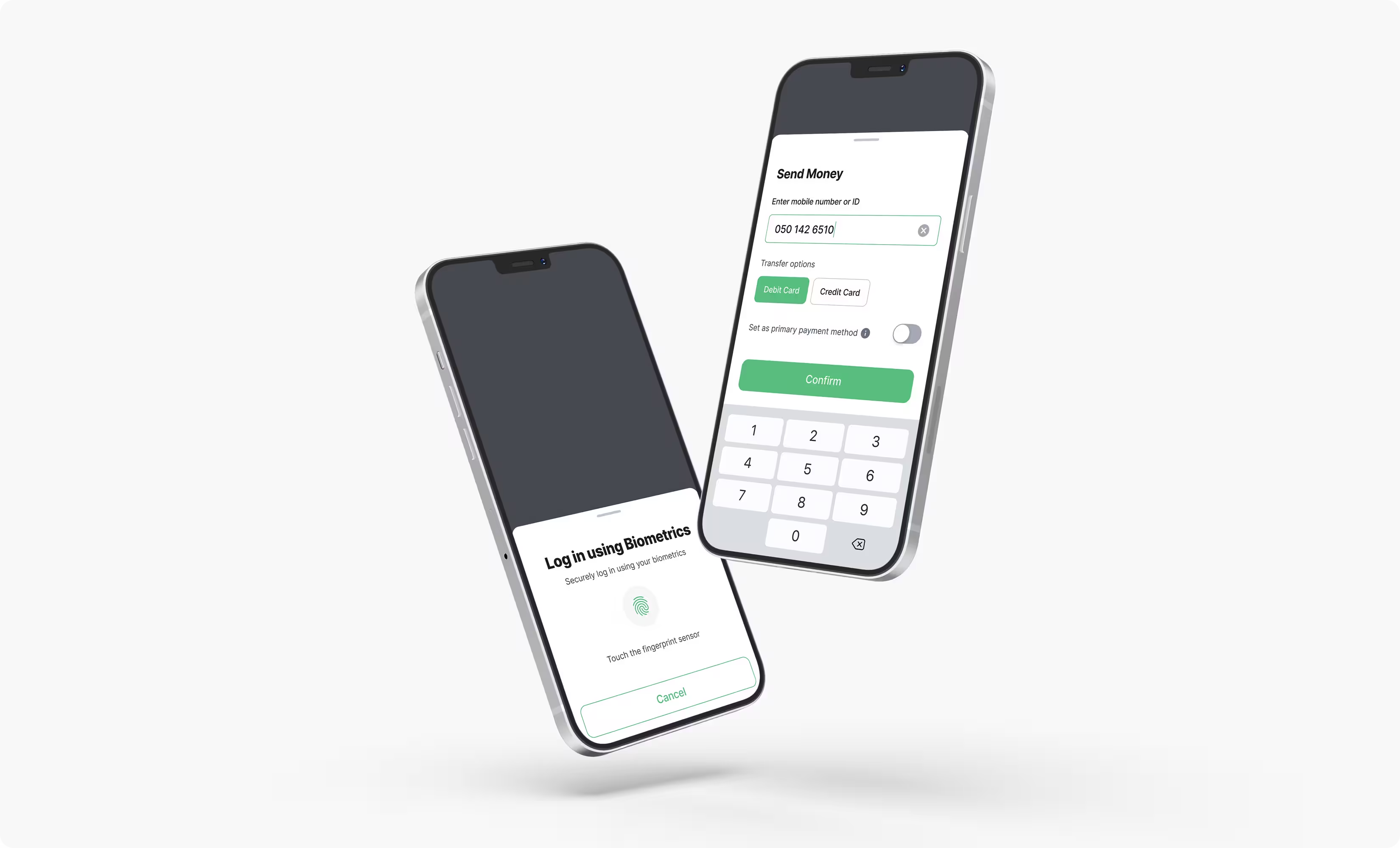
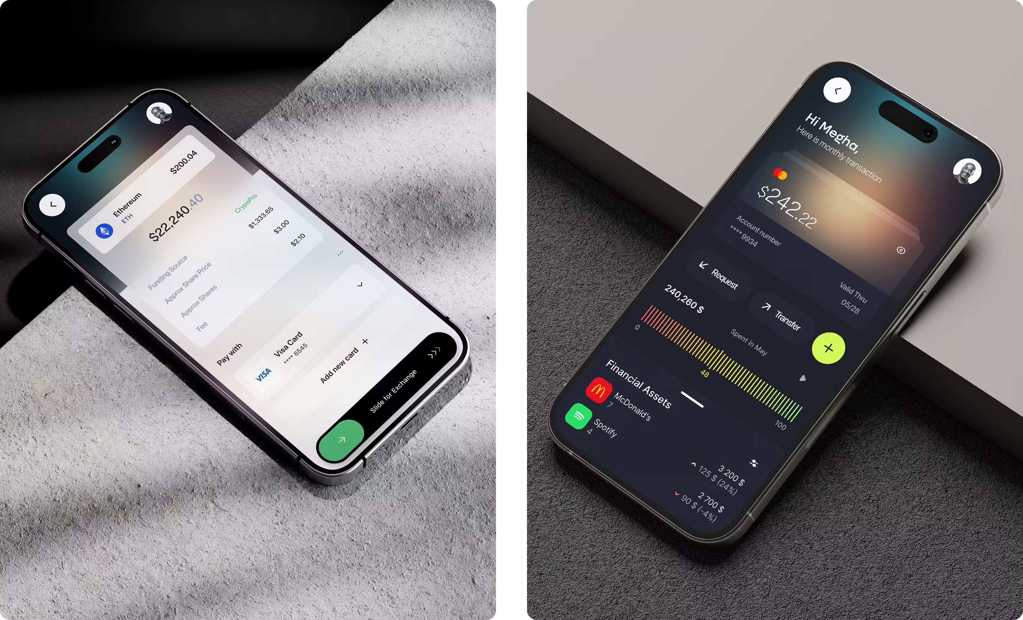
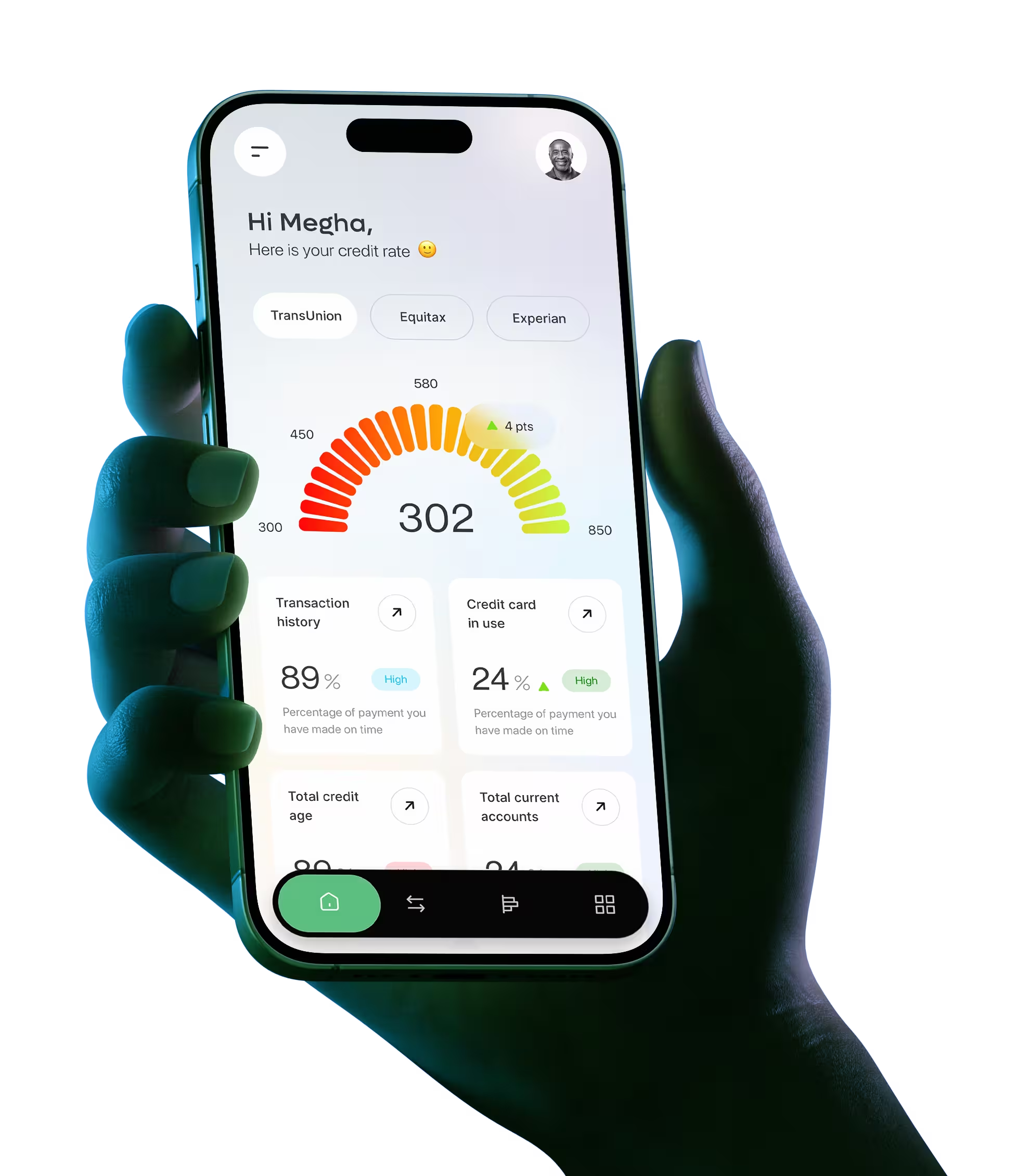
The final screens carry the icon-and-label system through every balance-related view — payments, transfers, account status — so users never have to relearn the distinction from screen to screen. The visual language stays deliberately quiet: no competing colors or callouts vying for attention, because the whole point was to reduce, not add, cognitive load.

Three months after launch, the numbers backed up what users had already told us.

Impact

  • Support tickets related to balance confusion dropped 28% in the first 3 months after launch.

  • In the same 12-participant usability round, the share of users who correctly identified points vs. real balance rose from 62% to 91%.

The fix wasn't a new feature. It was making one distinction impossible to miss.

Conclusion

Looking back, the biggest lesson from Bonus PIU was that ambiguity is usually more of a hierarchy problem than an information problem. Users didn't need a longer explanation of how points worked; they needed the interface to make the distinction obvious without reading anything. If I had another iteration, I'd validate the icon-and-label pattern against real earn-and-spend behavior in at least one of the international markets before treating it as a reusable standard — Turkey confirmed the concept, but partner ecosystems in Germany or Mexico could behave differently enough to need adjustments. That's the lens I now bring to any product where two similar-looking values sit on the same screen — balances, currencies, statuses — anywhere a glance has to do the work an explanation used to.