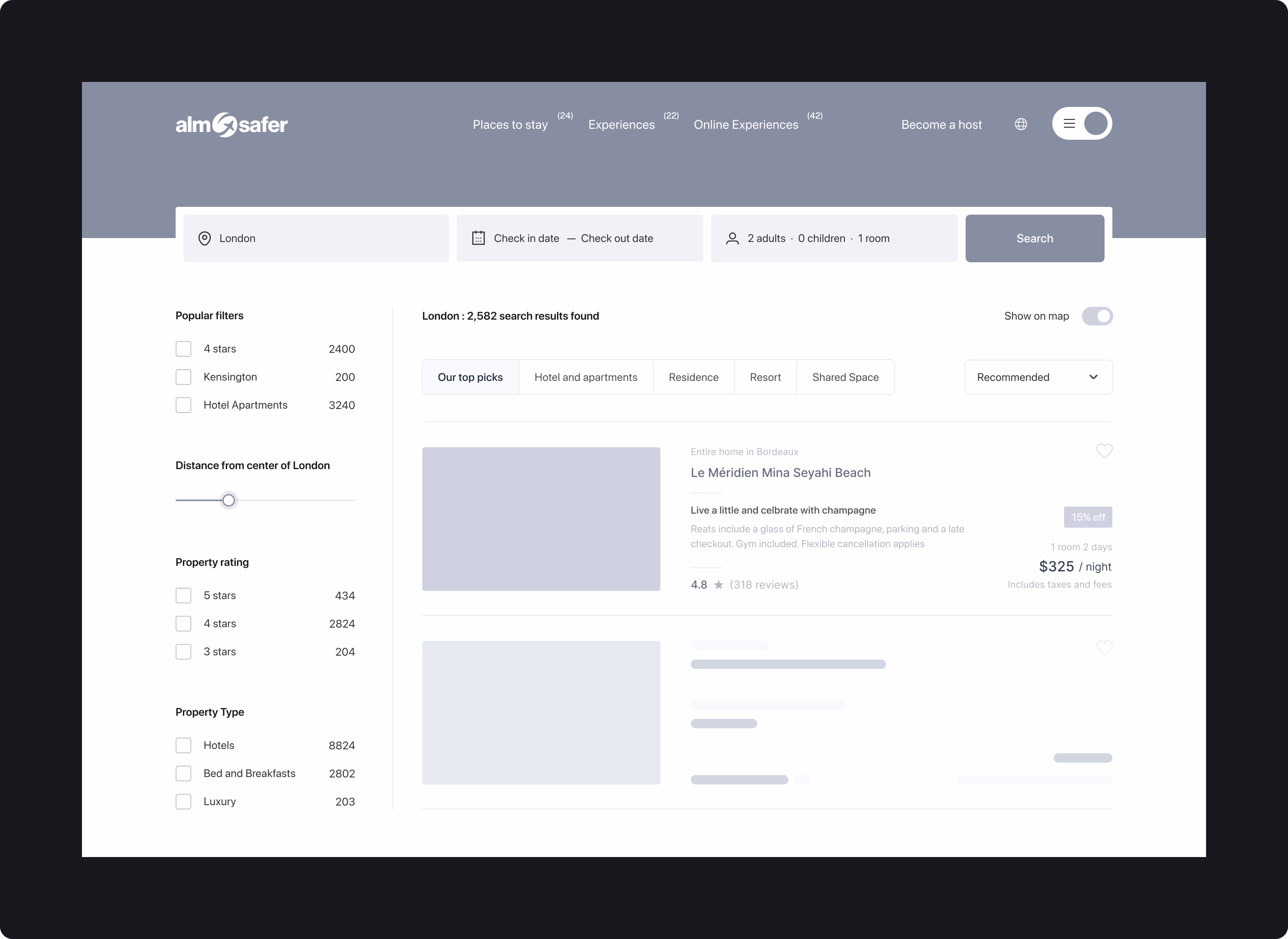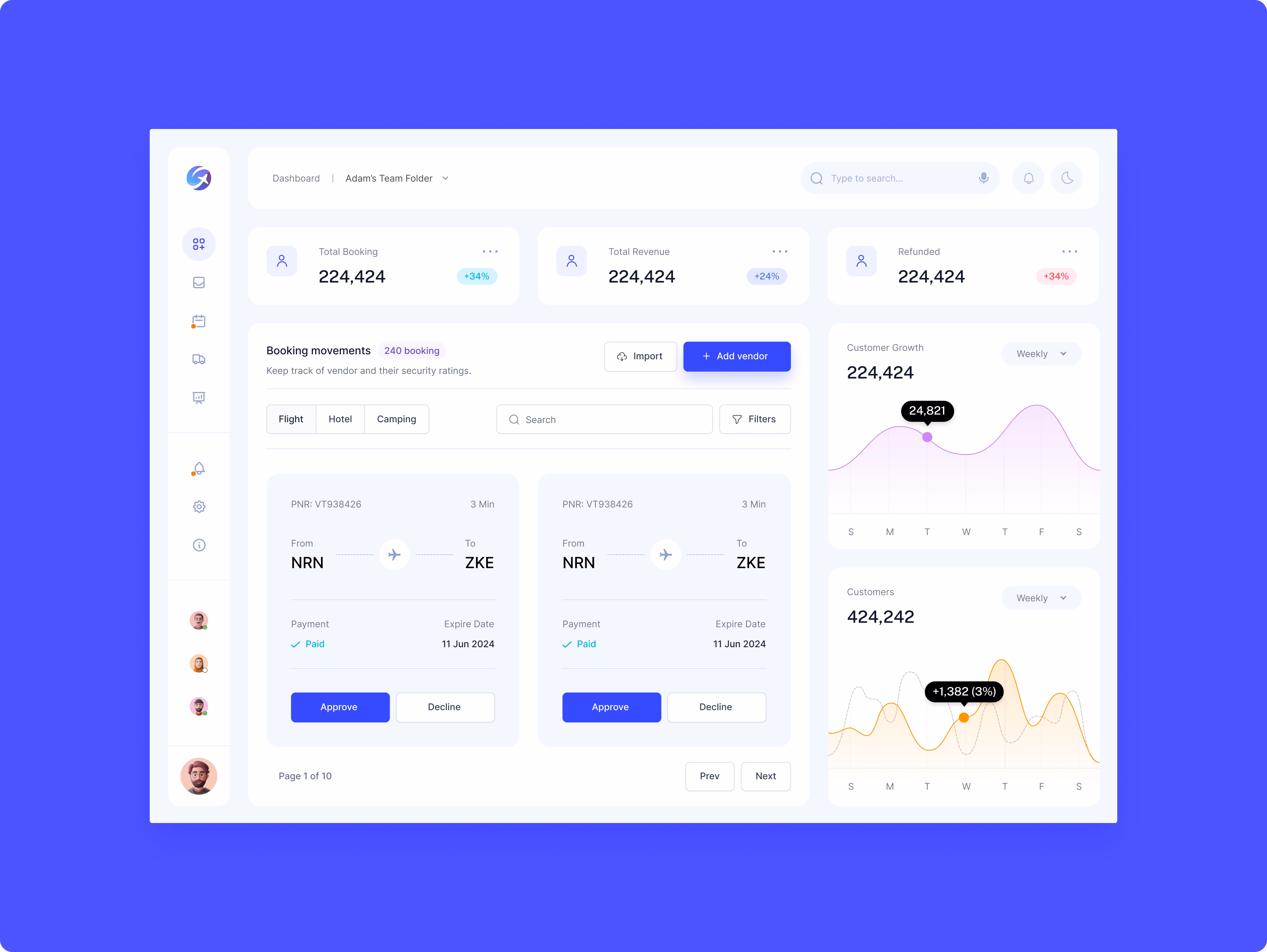
Almosafer is a leading travel brand in the Middle East, delivering end-to-end travel experiences through scalable digital platforms and a strong omni-channel ecosystem. The platform provides access to over a million hotels worldwide and flights from hundreds of airlines, alongside a broad range of travel services, including holiday packages and car rentals.
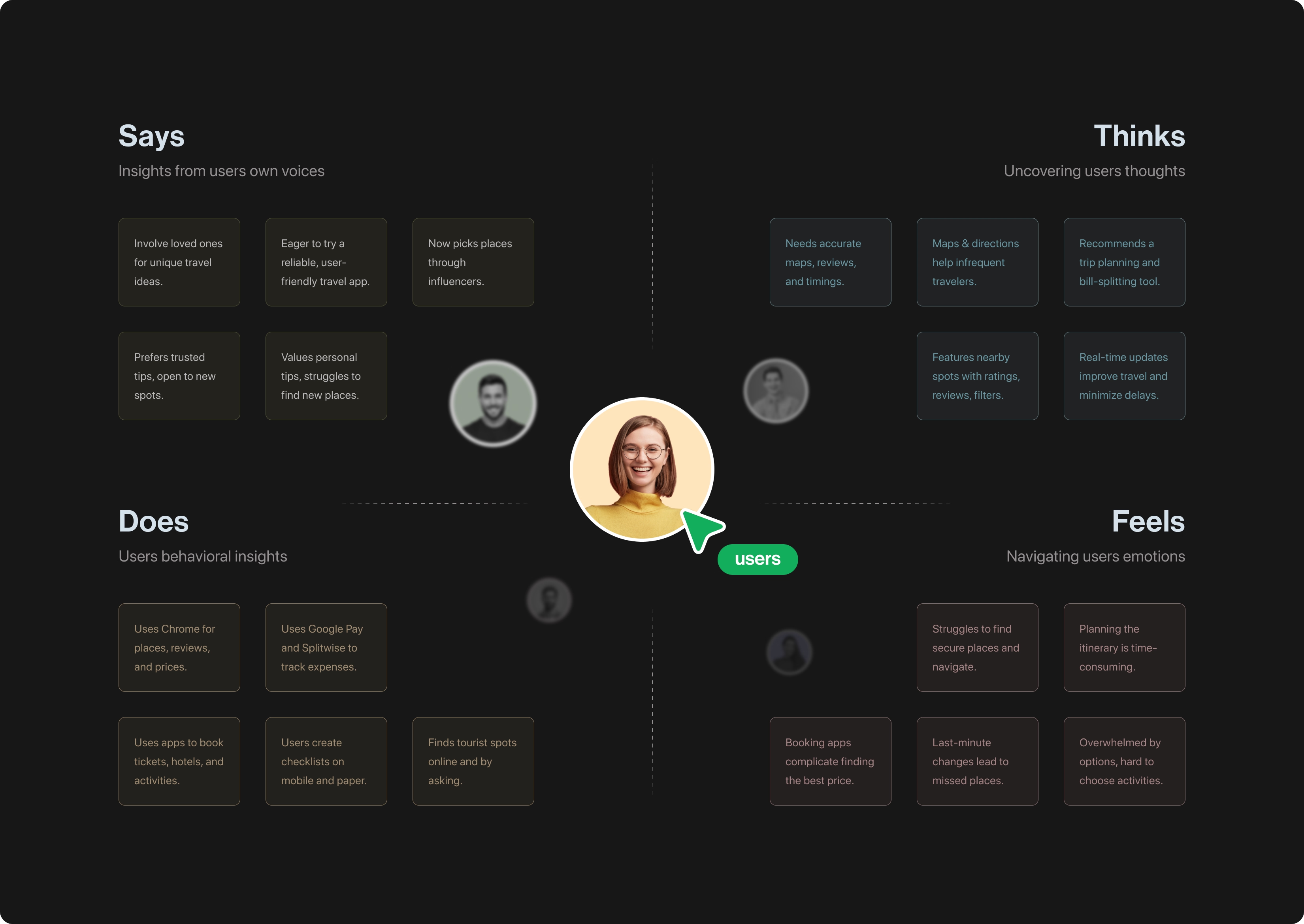
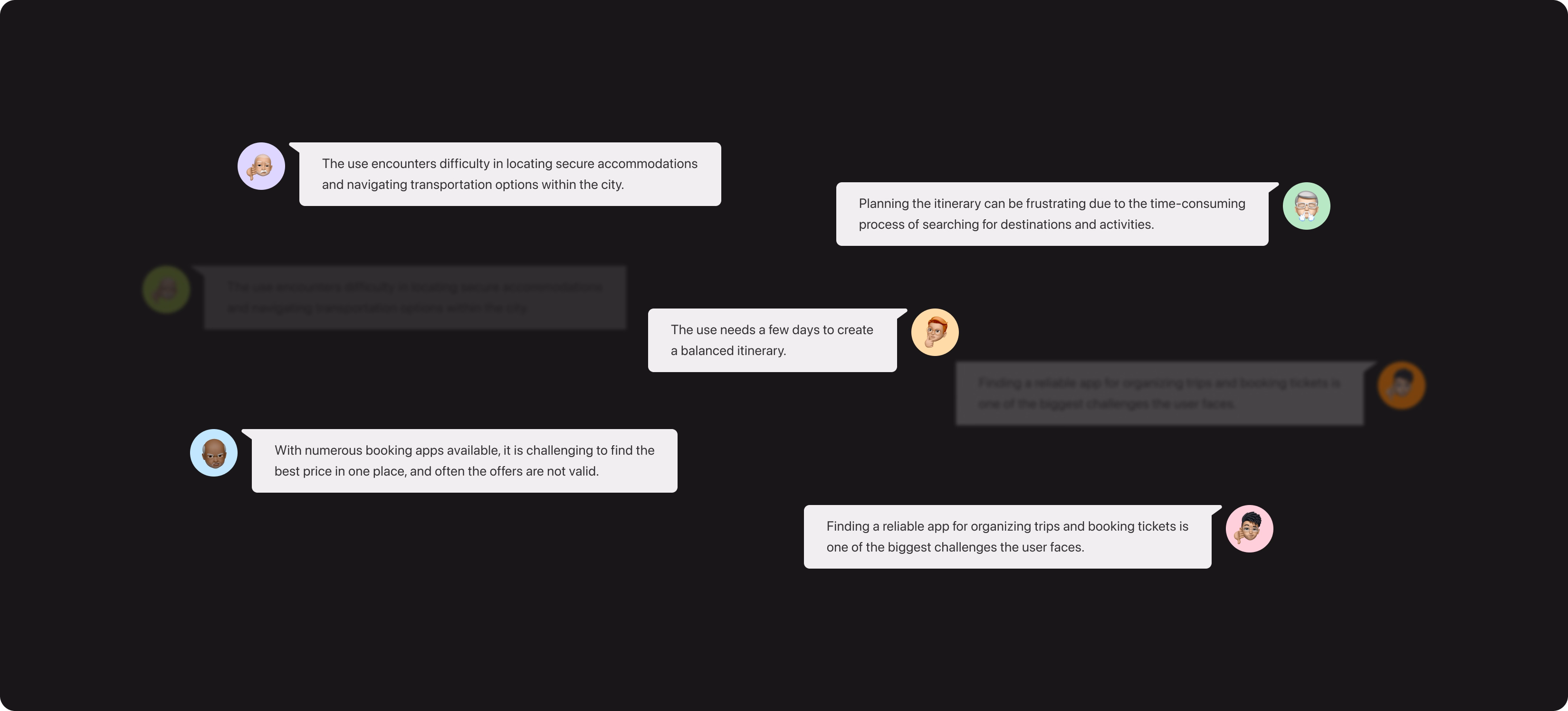
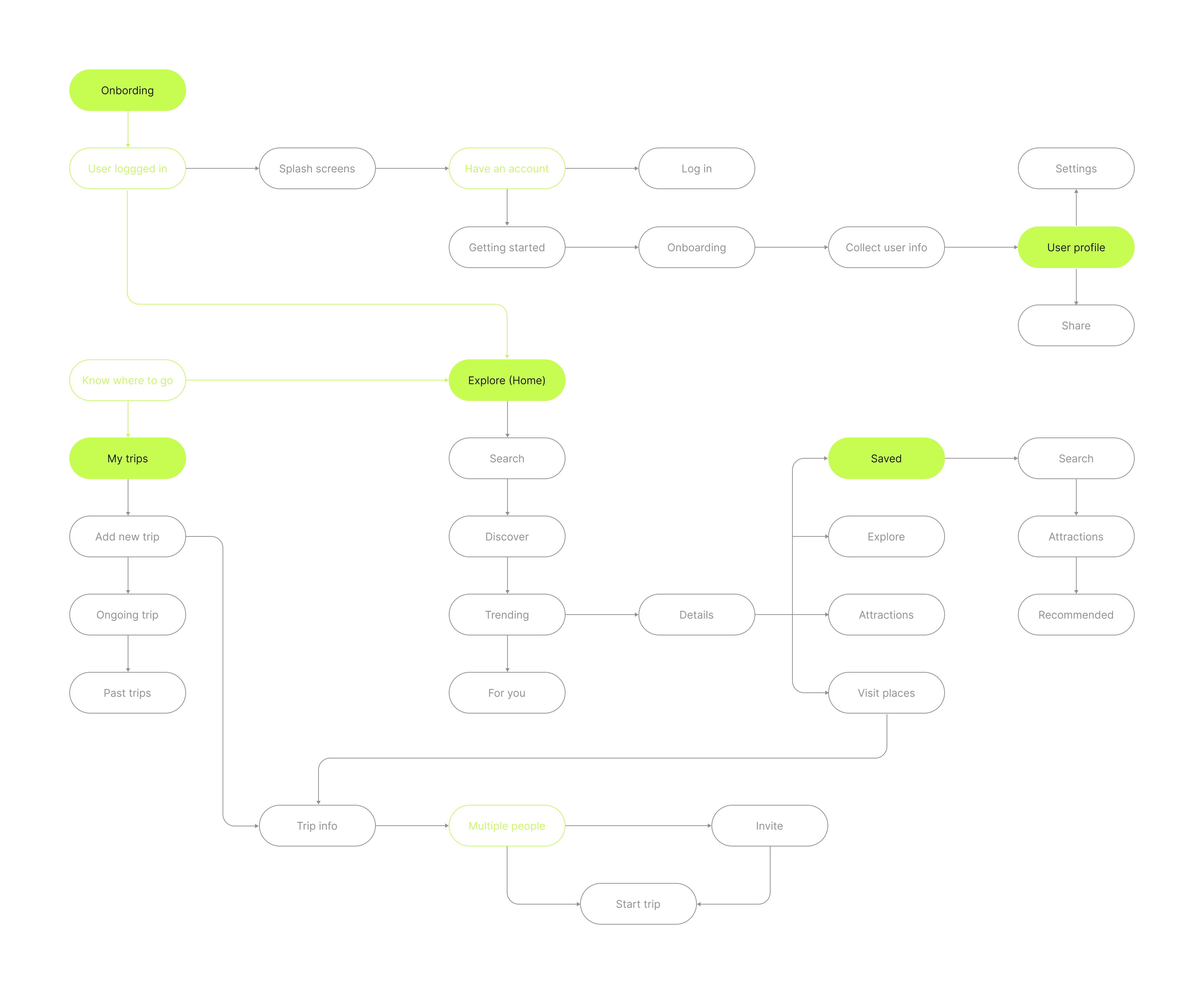
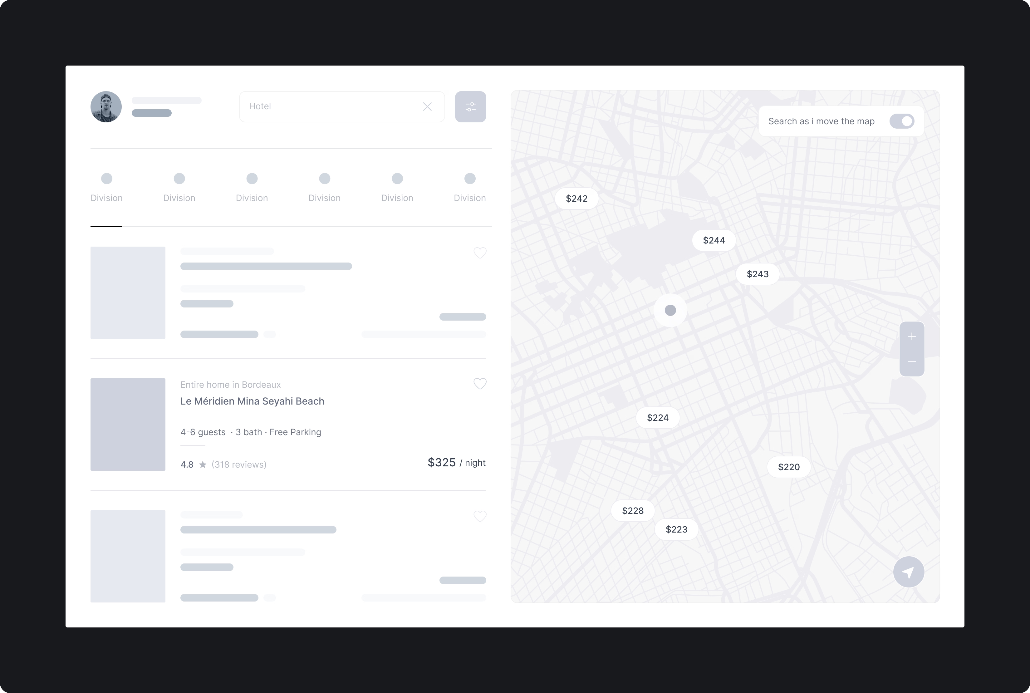
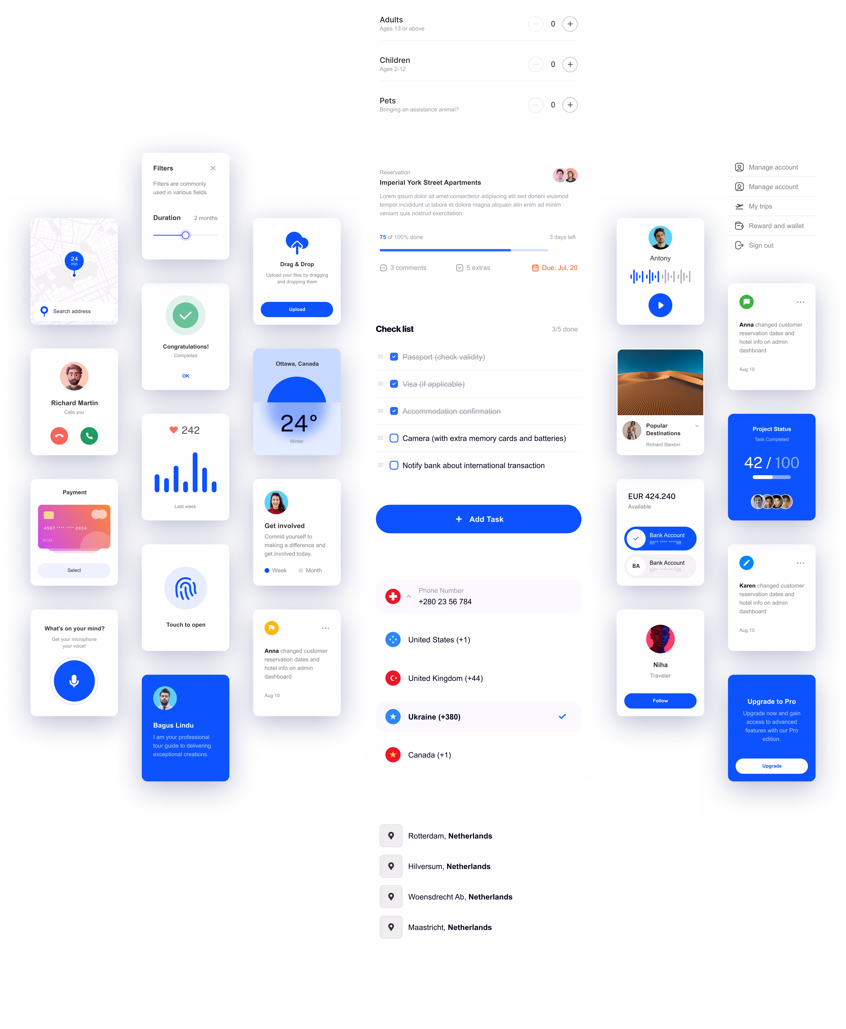
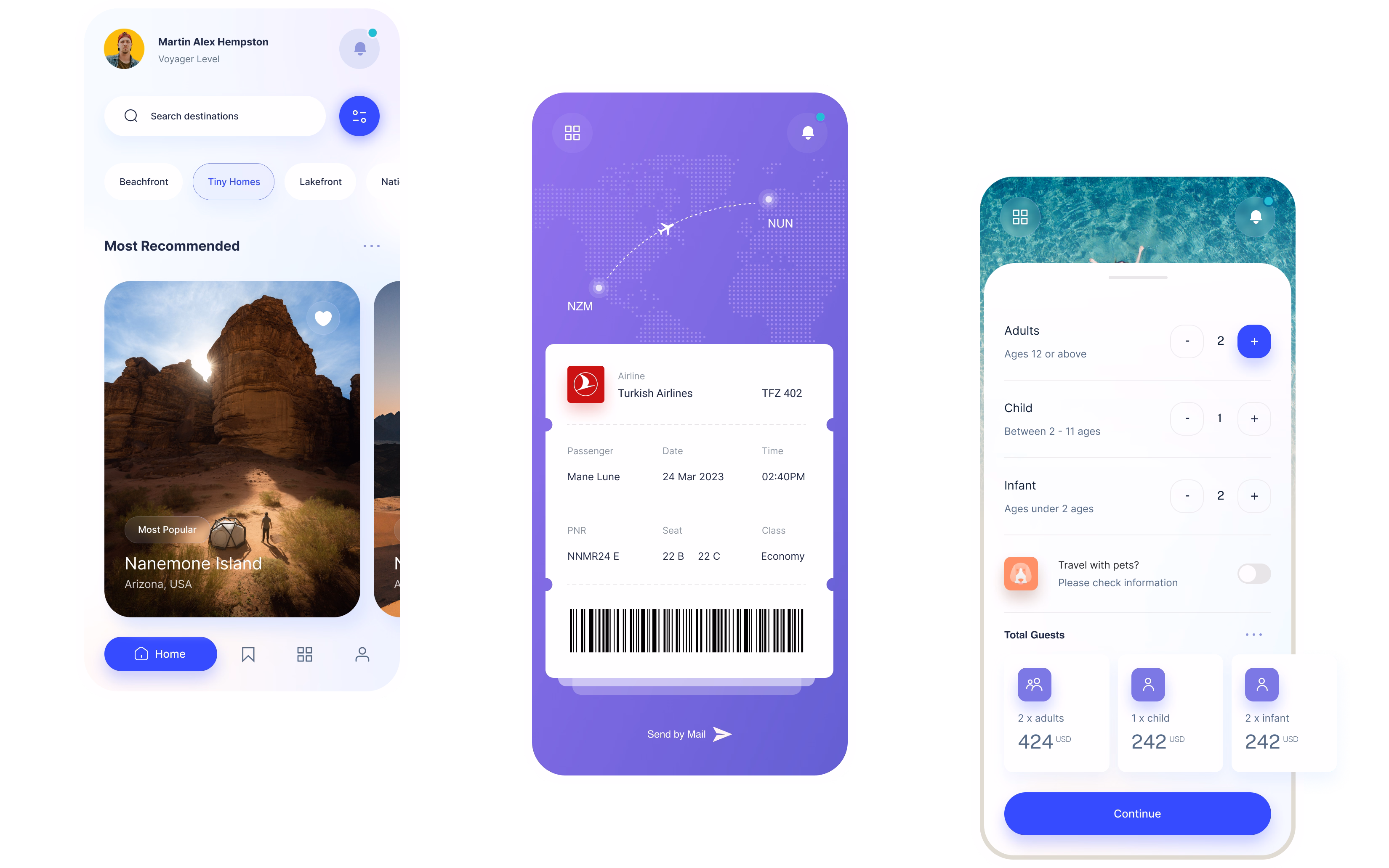
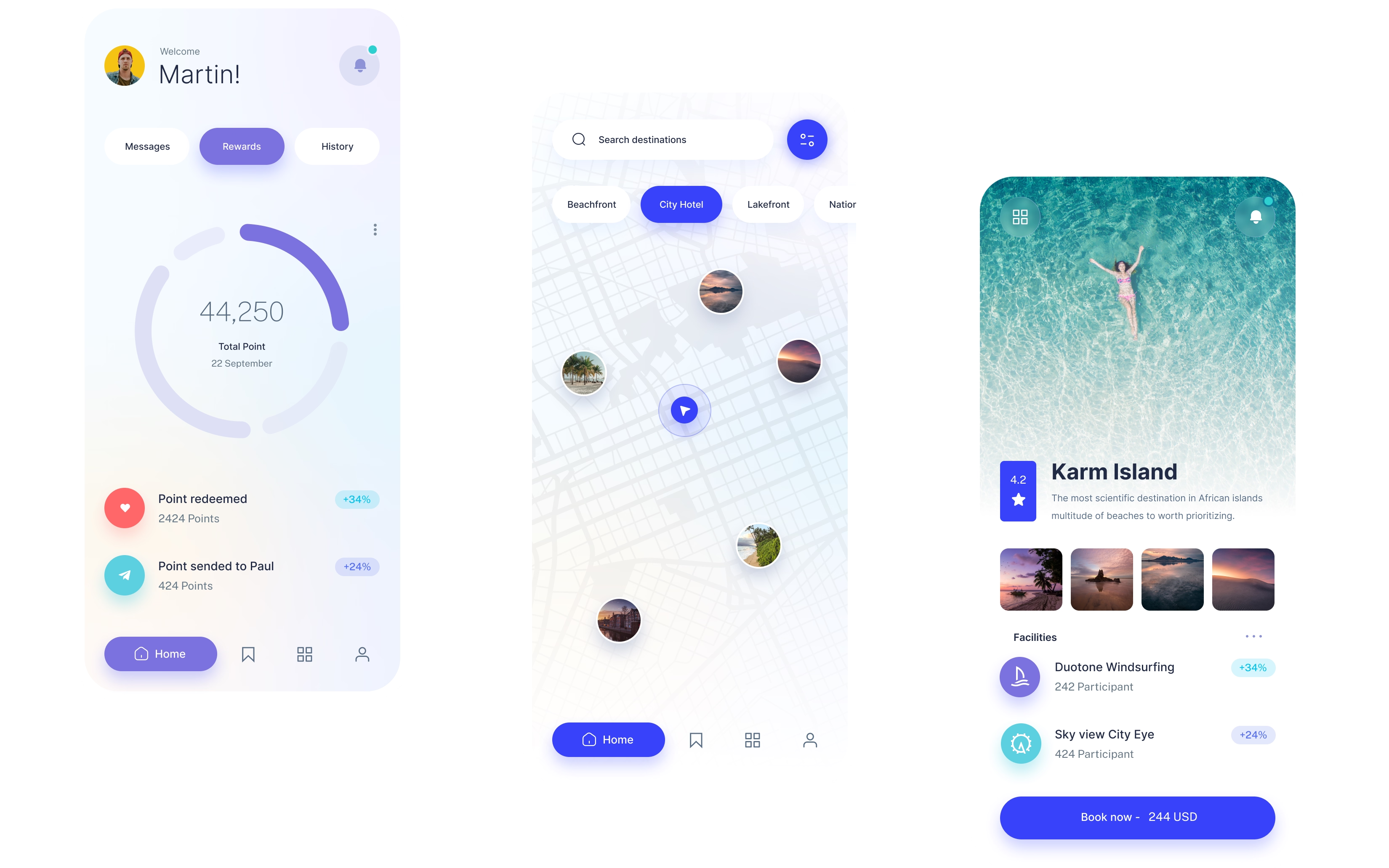
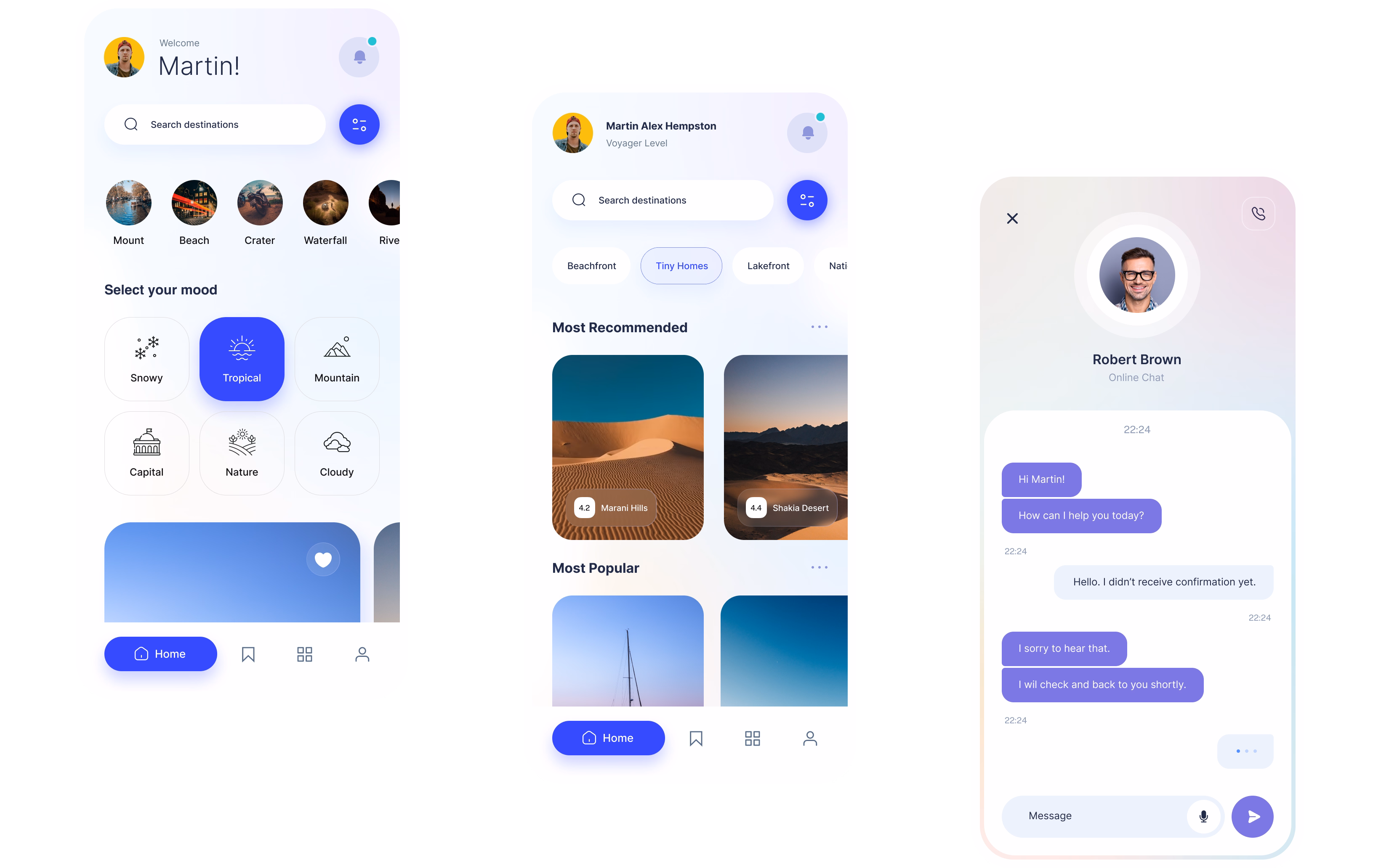
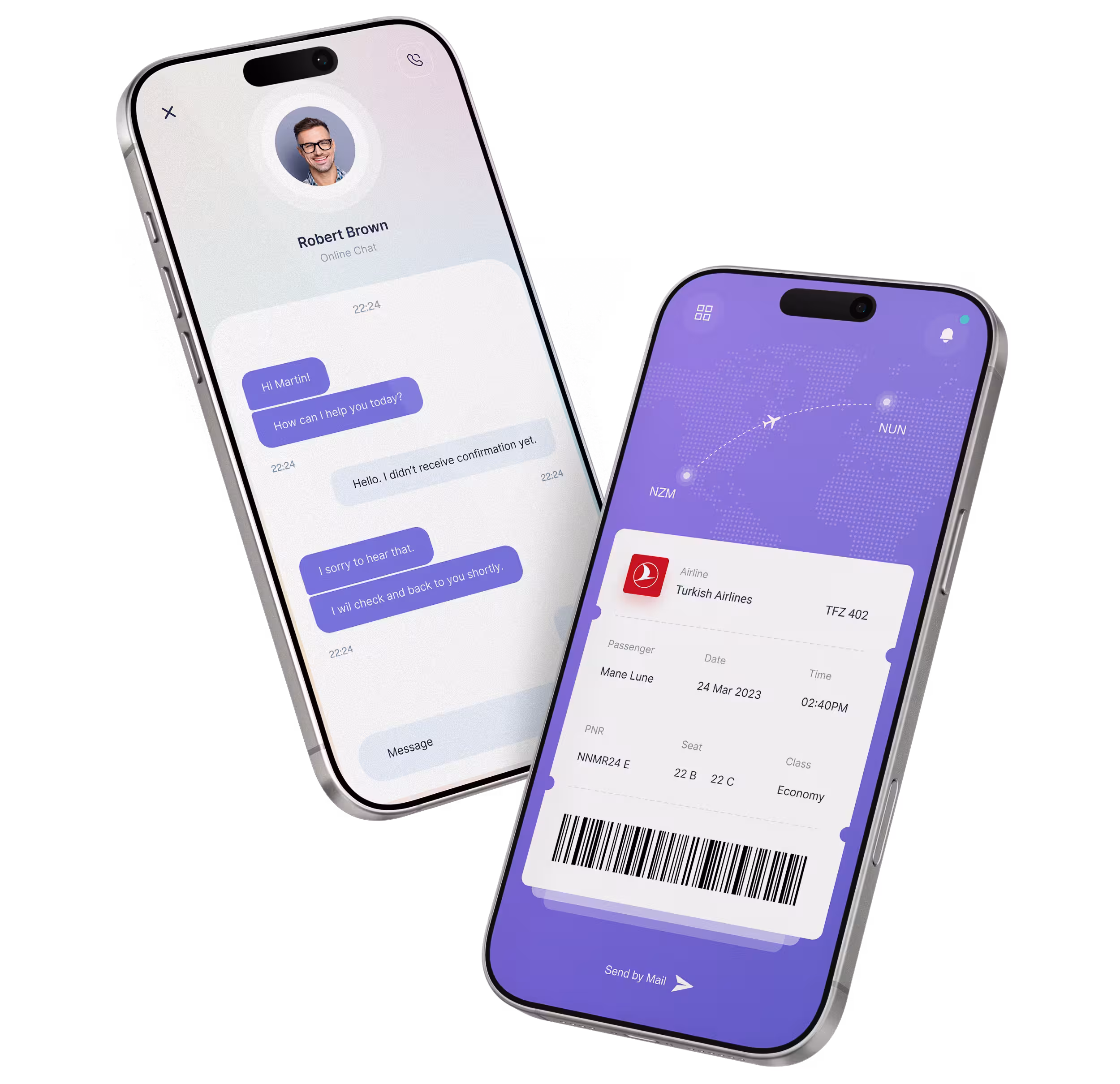
Almosafer users were juggling separate apps to plan a single trip — booking a flight in one place, finding a hotel in another, then piecing together an itinerary by hand. The travel companion app's job was to close that gap: bring flight, hotel, and itinerary planning into one flow.
But the deeper problem surfaced once testing began: for a meaningful share of users, the challenge wasn't finding a hotel — it was deciding where to travel in the first place. That single reframe shaped the direction of the entire redesign, starting with how search itself begins.
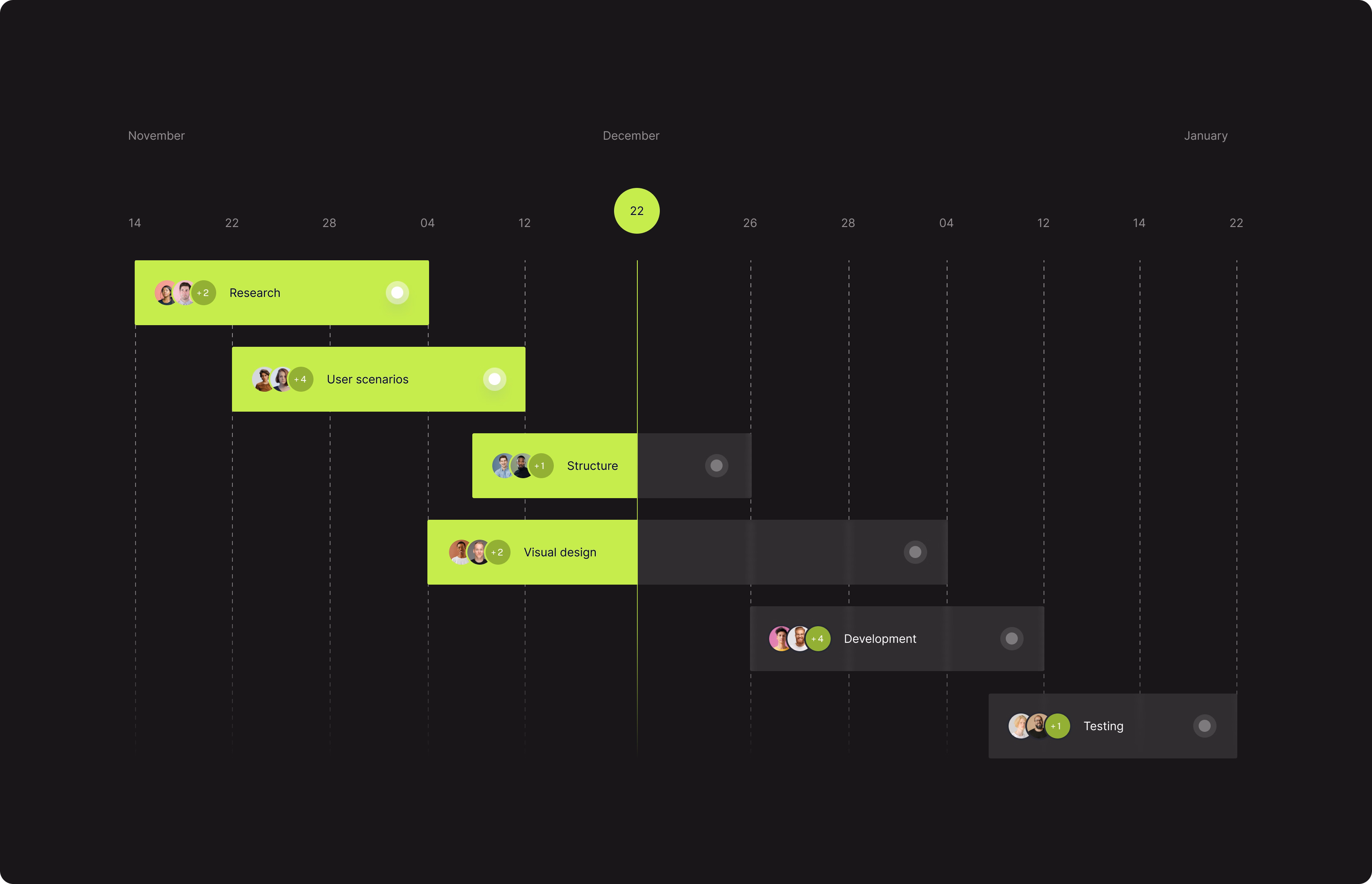
Through workshops I facilitated with key stakeholders, I aligned business goals with user needs and translated insights into clear UX directions. This process enabled actionable initiatives across design, engineering, and business teams, supporting a shared product vision across the team.